Evaluation Activity 1)
In what ways does your media product use, develop or challenge forms and conventions of real products?
In order for our thriller opening to conform to the conventions and forms or real media products, we created our own distributor and production company logos which many companies use in real life, such as 'Disney' or 'Universal'. On the left are the logos we designed for 'Breezeblocks Productions' and 'Clockwork Distributors' and on the right are examples of company logos that are used in films today.


At first we wanted the title of our opening to appear at the end, however, we found that by doing that our film opening would have looked more like a trailer, therefore we decided to have our title at the very beginning of our opening.
The only thing we did slightly differently to other thriller movies is that instead of introducing the characters first and showing the credits (director, script writer, etc) we showed the title straight away to immediately get right into the opening.
Our title includes a mixture of capital and lower case letters ('DiSoRiEnTaTiOn') because we wanted to make it seem like the whole opening is slightly disorientated.
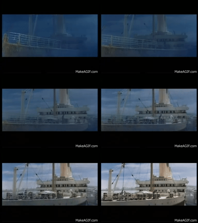
In order to do this, we used many flashbacks in our opening. The flashbacks are used when our protagonist gets home and follows the same route as our antagonist, for example: when the protagonist (portrayed by Natalia) walks up the stairs, it cuts to a black and white flashback because the antagonist (portrayed by myself) previously made their way up the stairs, however Natalia's character is completely unaware of this. We got this idea of flashbacks from films such as 'Saving Private Ryan', 'The Notebook', 'The Conjuring' and 'Titanic' where flashbacks are used in the opening scene. The flashbacks may also make the audience feel tense, as they know something the character doesn't.
B&W flashback in our opening
Flashback in 'Titanic'
Furthermore our thriller opening conforms to real film openings through our camera angles and the use of the establishing shot. Our location of our film was the protagonists house and this shot (below to the left) clearly introduces that. This could possibly make the audience watching feel slightly 'creeped out' as this shot may be implying that was is going on inside this particular house could happen in any house, and if this was a real movie and people went to view it in the cinema, it could possibly result in them feeling a slight discomfort in their own home because they may be thinking about what could happen.
 When filming, we got Natalia to hold the camera. It is slightly shaking to portray the fact she is walking. The point of view shot make the audience feel like they are in the protagonists shoes. This may make them feel slightly uneasy and tense, as previously in the opening we have made it clear there is someone in the house.
 Our shot of the house can also make the audience feel tense because from the outside it looks completely normal and ordinary whereas inside they are aware there is a villain, and because the protagonist is so blissfully unaware of what is inside, tension is created.
 The scene we used for our own opening could be compared with a scene from the film 'The Woman in Black' (right) where an establishing shot of the house could result in the audience feeling uncomfortable.
Other shots from our opening create tension, a key convention of a thriller. For example, shot A and B create tension as they indicates the idea of being watched. It is even more tense and uncomfortable for the audience as the protagonist is being watched from a window in their own house, therefore indicates some sort of intrusion.
Shot A


Shot B

Also shot C (above on the right) creates tension because it shows the antagonist ripping off a photograph of the protagonist and a friend. They leave the ripped photo of the friend on the floor, taking the bit with the protagonist, which may confuse the audience and leave them to wonder why the antagonist took the photo and what they are going to do with it. This shot also makes it clear that our thriller's sub-genre is a stalker thriller.
Finally, the fact the antagonists face is never revealed creates tension, as the audience do not know how if they know the person they're stalking, why they're doing it or for how long. It leaves a lot of questions.
The music we used for our thriller opening is similar to the music in the film 'Sinister'. It creates tension and makes the audience feel slightly on edge and tense. We used music to create the feel of disorientation, for example during the flashback clips we used the sound of a film tape/clicker.


No comments:
Post a Comment